
vue-sw-table
v1.1.9
Published
A tablelist basic el-table
Downloads
21
Maintainers
 skyewang
Readme
vue-sw-table
注:此组件基于element-ui,对el-table二次封装,需要安装element-ui(2.10.0及以上)
 当前版本支持大部分的表格操作,例如:
 显示文本(p)、编辑数字(number)、编辑文本(input)、日期选择(date)、下拉选择(select)、
 多选(check)、文本链接(link)、按钮(button)等...
下载源码后
启动项目:npm run serve
demo配置路径:examples/App.vue
组件路径:packages/swTable/src/ 对应详细用法请见下列说明(待补充)项目安装
npm install vue-sw-table在main.js中引入并使用
import table from 'vue-sw-table'Vue.use(table)组件用法及用例
example:
在template中需要传入显示options的配置
其中tableData为传入的数据源(也可以使用属性listdata来赋值)
下面上代码看效果
template:
<vue-sw-table :options="options" :table-data="data"></vue-sw-table>
script:
data() {
return {
options:[
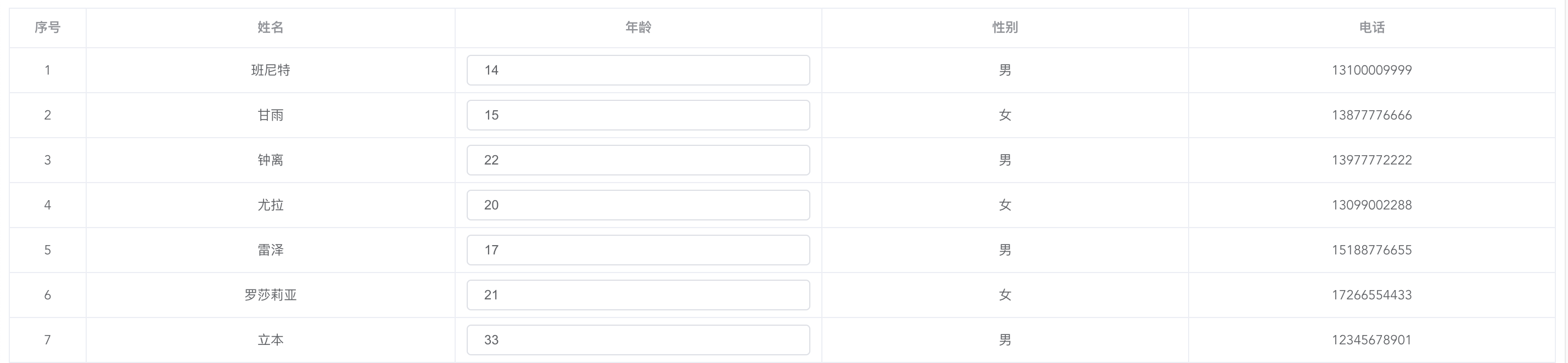
{l:'序号',order:true,width:70 },
{l:'姓名',p:'name'},
{l:'年龄',p:'age',number:true},
{l:'性别',p:'sex'},
{l:'电话',p:'tel'},
],
data:[
{ name: '班尼特', age: '14', sex: '男', tel: '13100009999', brithday: '1999-01-03' },
{ name: '甘雨', age: '15', sex: '女', tel: '13877776666', brithday: '1999-01-03' },
{ name: '钟离', age: '22', sex: '男', tel: '13977772222', brithday: '1999-01-03' },
{ name: '尤拉', age: '20', sex: '女', tel: '13099002288', brithday: '1999-01-03' },
{ name: '雷泽', age: '17', sex: '男', tel: '15188776655', brithday: '1999-01-03' },
{ name: '罗莎莉亚', age: '21', sex: '女', tel: '17266554433', brithday: '1999-01-03' },
{ name: '立本', age: '33', sex: '男', tel: '12345678901', brithday: '1999-01-03' },
]
}options效果如下:
再来看个稍微复杂的例子
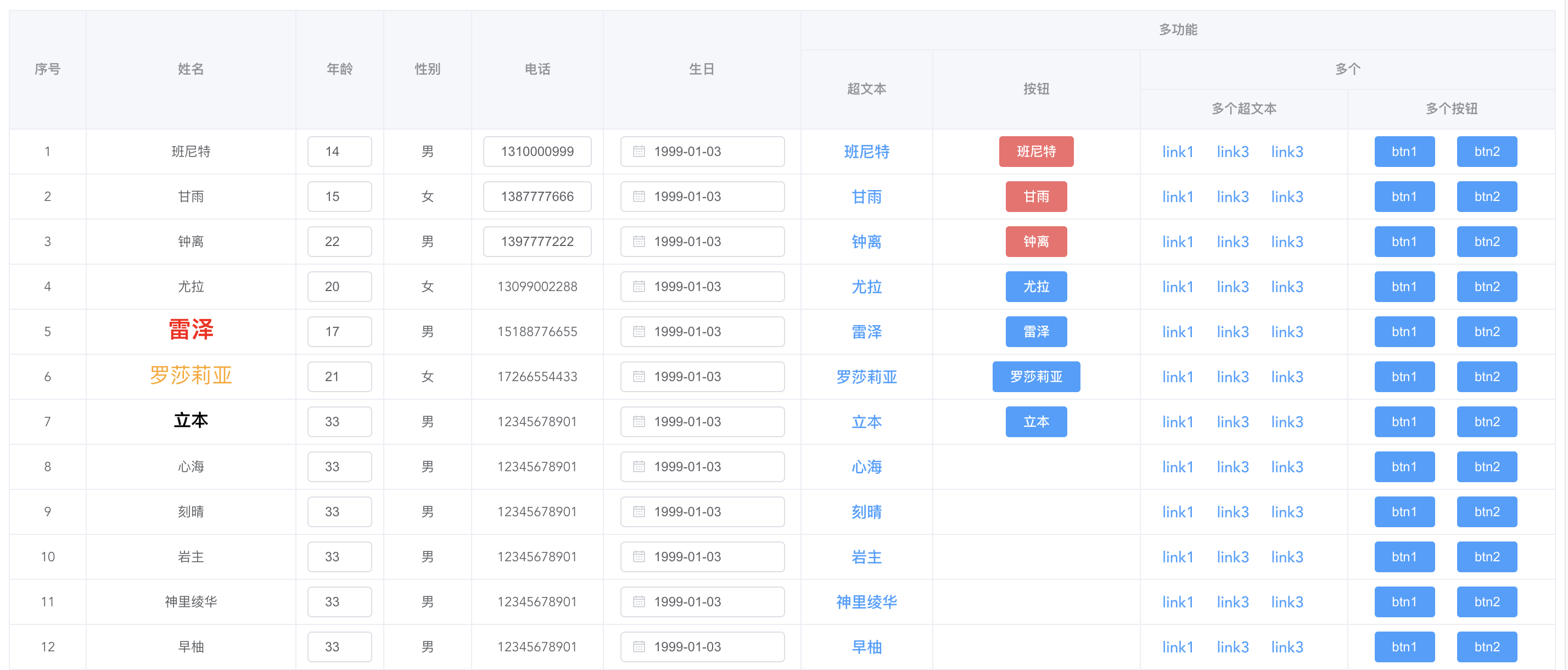
options: [
        { l: '序号', order: true, width: 70, align: 'center' },
        {
          l: '姓名',
          p: ({ row }) => {
            return row.name
          },
          style: ({ row }) => {
            if (['雷泽'].includes(row.name)) {
              return { color: 'red', 'font-weight': 600, 'font-size': '21px' }
            } else if (['立本'].includes(row.name)) {
              return { color: 'black', 'font-weight': 600, 'font-size': '16px' }
            } else if (['罗莎莉亚'].includes(row.name)) {
              return { color: 'orange', 'font-size': '19px' }
            }
          },
        },
        { l: '年龄', p: 'age', number: true, width: 80 },
        { l: '性别', p: 'sex', width: 80 },
        {
          l: '电话',
          p: 'tel',
          width: 120,
          input: ({ row, index }) => {
            console.log(row)
            return !![0, 1, 2].includes(index)
          },
        },
        {
          l: '生日',
          p: 'brithday',
          date: true,
          datetype: 'date',
          format: 'yyyy-MM-dd',
          valueFormat: 'yyyy-MM-dd',
          e_style: { width: '150px' },
          width: 180,
        },
        {
          l: '多功能',
          s: [
            {
              l: '超文本',
              link: true,
              content: ({ row }) => {
                return row.name
              },
              width: 120,
            },
            {
              l: '按钮',
              button: true,
              hidden: ({ index }) => {
                return !![0, 1, 2, 3, 4, 5, 6].includes(index)
              },
              content: ({ row }) => {
                return row.name
              },
              type: ({ index }) => {
                return [0, 1, 2].includes(index) ? 'danger' : 'primary'
              },
              func: ({ row, index }) => {
                console.log('点击了' + index + '行:' + row)
              },
            },

            {
              l: '多个',
              s: [
                { l: '多个超文本', link: [{ content: 'link1' }, { content: 'link3' }, { content: 'link3' }], gutter: 20 },
                { l: '多个按钮', button: [{ content: 'btn1' }, { content: 'btn2' }], gutter: 10 },
              ],
            },
          ],
        },
      ],
根据以上options效果如下:
======================================
参数详情
根据需求配置 option 来改变表格的样式,因为是基于el-table的二次封装,
对于el-table的大部分属性都相同适用,另外加入了简单的配置比如:width、style、align等...
详细配置的参数可以耐心的看下面详解
l
label 显示的列头文本》
l 传入数组时自动换行(数组中每个元素为一行)
{l:''}
{l:['','']}
p
prop 显示的数据源字段 or 回调函数
p 传入数组时自动换行(数组中每个元素为一行)使用于回调中
{p:''}
{p:['','']}
{p:({el,row,index})=>{return ''}}
order
排序 自动+1
{order:true}
s
嵌套子列
{s:[{l:'',p:''},{l:'',p:''}]}
number
只可编辑-数字 文本框
eFunc 编辑时处理函数,返回值为:{val,row,index} --- val:编辑后的值 row:编辑行 index:编辑下标数
--- efunc (放弃焦点回调) 该函数可以处理编辑后的大部分操作 (例如计算当前行合计值)
--- ifunc (实时改变回调) 该函数可以处理编辑后的大部分操作 (例如计算当前行合计值)
--- point:1 (or true) 设置此属性 则可编辑内容为浮点型 保留小数据后为 point 设置的位数(为 true 时默认两位)
{number:true,eFunc:({val,row,index})=>{ console.log(val,row,index) }}
{number:true,iFunc:({val,row,index})=>{ console.log(val,row,index) }}
{number:true,point: 2}
input
可编辑-字符串 文本框
eFunc 编辑时处理函数,返回值为:{val,row,index} --- val:编辑后的值 row:编辑行 index:编辑下标数
--- efunc (放弃焦点回调) 该函数可以处理编辑后的大部分操作 (例如输入本文后自动保存)
--- ifunc (放弃焦点回调) 该函数可以处理编辑后的大部分操作 (例如输入本文后自动保存)
{input:true,eFunc:({val,row,index})=>{}}
{input:true,iFunc:({val,row,index})=>{}}
button
可触发事件按钮
button :'true' or '[]' (true:只创建一个 button,[]:根据数组内的个数创建对应个数的 button; eg: {button[{ content:'',button_noti:'',type:''}]})
gutter: 0(默认) 当 button 传入数组时 gutter 表示 button 间隔 px(单位默认'px')
content:显示的链接文本'string' or 传入一个有返回值的函数'function'(用于处理不同条件下文本的显示)(返回值:{row,el,index} row:行 el:传入的该列配置 index:下标)
button_noti:父类传入的回调名 用于触发事件的回调 返回值:{ row, el, index } --- row:行子对象 el:列配置 index:下标
type:button 的类型 (默认:primary):primary success warning danger info
func:button 的事件回调 (默认不写的话走:button_noti) 回调参数为 { row,el,index }
{button:true content:'',button_noti:'',type:'',func:({ row })=>{}} 创建一个 button
{button:[{content:'',button_noti:'',type:''}],gutter:'10',} 一列中创建多个 button,gutter 为每个 button 的间隔
{button:true content:({el,row,index})=>{},button_noti:'',type:''} 传入回调(content,type)的回调
link
可触发事件链接
link :'true' or '[]' (true:只创建一个 link,[]:根据数组内的个数创建对应个数的 link; eg: {link[{ content:'',link_noti:'',type:''}]})
gutter: 0(默认) 当 link 传入数组时 gutter 表示 link 间隔 px(单位默认'px')
content:显示的链接文本'string' or 传入一个有返回值的函数'function'(用于处理不同条件下文本的显示)(返回值:{row,el,index} row:行 el:传入的该列配置 index:下标)
link_noti:父类传入的回调名 用于触发事件的回调 返回值:{ row, el, index } --- row:行子对象 el:列配置 index:下标
type:link 的类型 (默认:primary):primary success warning danger info
func:点击link的回调
{link:true content:'',link_noti:'',type:''} 创建一个 link
{link:[{content:'',link_noti:'',type:''}],gutter:'10',} 一列中创建多个 link,gutter 为每个 link 的间隔
{link:true content:({el,row,index})=>{},func:({row})=>{},type:''} 传入回调(content,type)的回调
check 选择框(多选)
checkbox 样式 传入对象 默认{}
checkedp 每行传入的 checked 绑定元素
checkHeader:true 为头部是否显示全选框
check:true 为显示每行选择框 可以为函数 ({row})=>{ return true} //其中 row 为每行数据
disabled:true 禁用
{ l: '', disabled : true, checkedp: 'checked', checkHeader: true, check: true, width: 40, align: 'center' },
{ l: '', checkedp: 'checked', checkHeader: true, check: ({ row }) => { return true }, width: 40, align: 'center' },
date 日期选择器
valueFormat 值显示格式
format 格式
datetype:date month 默认 date
e_style:{width:120} datepicker 的 style 为对象 默认{width:120}
{ l: '', date : true, valueFormat: 'yyyyMMdd', format: 'yyyyMMdd',e_style: {width:'120px'}},
select 选择器
select:true 选择器
arr 格式为 [{name:'',value:''}]
clearable 允许清空
disabled 禁用
multiple 允许多选
{ l: '', p: '', select: true, arr: [], width: 150 , clearable: true, multiple: true,disabled: true }
trans 转换文本
trans_map:传入的对象 根据 ‘p’ 值转换成对应的文本(多用于状态:数字转文本) 下列'p'为 1 时,当前列行显示'aaa'
{trans:true,trans_map:{'1':'aaa','2':'bbb'}}
width 列宽度
非必要 默认''
{width:100}
align 文本对齐
非必要 默认 left
{align:'center'}
fixed 左右固定悬浮
非必要 默认 无悬浮
{fixed:true}
style 传入样式
css style 样式 传入对象 默认{}
{style: {'font-size':15+'px'}}
{style: ({ row }) => { return {'font-size':row.size+'px'}}}
sortable 升降序
默认 false
{sortable: true}
坐标沈阳、有问题欢迎一起讨论:
QQ:415333856
wx同号
目前只支持vue2.x版本,vue3.x版本敬请期待。