
vue-win-mgr
v0.9.2
Published
A drag/dock window manager for Vue 3 components.


Readme
vue-window-manager
This provides a Blender / QT / Unity, etc like Window Manager.
HOMEPAGE - https://orokro.github.io/Vue-Window-Manager/
Project Setup
npm installCompile and Hot-Reload for Development
npm run devCompile and Minify for Production
npm run build▶️ TUTORIAL
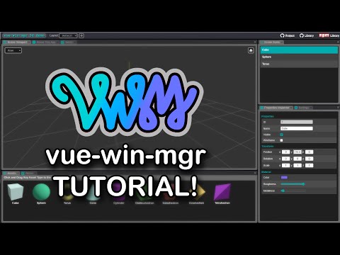
🎛️ DOCS
A powerful, highly customizable, Vue 3-based window manager for building creative, Blender-like, QT-style applications with floating, dockable, tabbed, and split-window interfaces.
📚 Table of Contents
- 🚀 Introduction
- 🧱 The
<WindowManager />Component - 🧩 Providing
availableWindows - 🗺 Defining a Layout
- 📐 Top Bar & Status Bar
- 🎨 Theming System
- ⚙️ Remaining Props
- 🪓 Splitting, Empty Frames & Merging
- 🖼 MWI Enhancements (Task Bar, Start Menu, Minimize)
- 🧠 JavaScript API: Contexts
- 🔧 WindowManagerContext
- 🪟 WindowFrameContext
- 📦 WindowContext
- 📦 Saving & Restoring Layouts
- 💾 Window State Serialization
- 🧼 Wrap Up
- 🔮 Coming Soon
🚀 Introduction
vue-win-mgr is a Vue 3-based layout and window manager designed for building creative applications that demand powerful, flexible, and dynamic interfaces.
Inspired by tools like Blender, Qt Creator, and other professional-grade apps, it allows you to create sophisticated layout systems with minimal boilerplate.
📐 Core Concepts
- WindowManager: Defines the screen space.
- Window Frames: Regions of the screen that can be resized, split, or merged.
- Windows: Individual components you provide, hosted inside frames.
- Frame Modes:
SINGLE: One window at a time (swap out with menu).TABBED: Like a browser — multiple window tabs.MWI: Free-floating window chaos (in a good way).
👉 You bring your Vue components. The window manager handles layout, snapping, tabs, drag-and-drop, and more.
🧱 The <WindowManager /> Component
This is the heart of the system. Drop it into your Vue template, and it takes care of rendering everything according to the availableWindows and layout you give it.
<WindowManager
	ref="windowManagerEl"

	:availableWindows="availableWindows"
	:defaultLayout="layout"

	:showTopBar="true"
	:showStatusBar="true"
	:topBarComponent="MyHeaderBar"
	:statusBarComponent="MyStatusBar"

	:splitMergeHandles="true"
	mwiBGPattern="/bg_pattern.png"

	:theme="{
		frameBGColor: '#002244',
		tabTextColor: '#ccc',
	}"
/>
You can also use named slots for the top and status bars:
<WindowManager :showTopBar="true" :showStatusBar="true">
	<template #topBar>
		<!-- custom header content -->
	</template>
	<template #statusBar>
		<!-- custom footer content -->
	</template>
</WindowManager>
Yes, you can mix and match: use a component for one bar and a slot for the other.
🧩 Providing availableWindows
This array tells the WindowManager what Vue components are valid windows. There are two ways to define them:
✅ Preferred: Object Form (Verbose)
const availableWindows = [
	{
		window: Viewport,
		title: "Scene Viewport",
		slug: "viewport",
		icon: 'icons/viewport.png'
	},
	{
		window: Notes,
		title: "Notes",
		slug: "notes",
		icon: 'icons/notes.png'
	}
];
⚡ Shorthand: Constructors Only
const availableWindows = [Viewport, Notes, About, Settings];Slugs will be auto-generated from the component name. The slug generator looks for:
component.namecomponent.__name- filename from
component.__file
⚠️ TIP:
Always prefer the object format for full control. Use the constructor-only form for quick prototypes.
🗺 Defining a Layout
Layouts describe how your screen is broken into regions (frames), and which windows live in each region.
const layout = [
	{
		name: "window",
		top: 0,
		left: 0,
		bottom: 1080,
		right: 1920
	},
	{
		name: "MainView",
		windows: ['viewport'],
		style: FRAME_STYLE.TABBED,
		left: 0,
		right: ["ref", "window.right-460"],
		top: 0,
		bottom: ["ref", "window.bottom-300"]
	},
	// more frames...
];
🧮 Frame Boundaries
Each frame defines top, left, right, and bottom using one of:
| Format | Meaning |
|--------|---------|
| 100 | Absolute pixel value |
| ['val', 50] | Same as the raw number, above - absolute pixel value |
| ['val', 50, '%'] | Adding '%' item, 50% of parent frame |
| ['ref', 'MainView.right'] | Reference to another frame edge |
| ['ref', 'MainView.right-460'] | Reference to another frame edge with math. Only + or - supported |
🧩 Window Entries
windows: [
	"notes",
	{ kind: "viewport", props: { someProp: true } }
]
You can mix plain slugs and objects with props.
📐 Top Bar & Status Bar
To show bars at the top or bottom of the WindowManager:
<WindowManager :showTopBar="true" :showStatusBar="true" />Then, provide either:
:topBarComponent/:statusBarComponent- or named slots
#topBar,#statusBar - or both!
🎨 Theming System
Pass a theme object to control look & feel.
theme: {
	frameBGColor: '#444',
	tabTextColor: '#ccc',
	windowBGColor: '#fff'
}
Full list of available theme keys:
const defaultThemeColors = {

	// background colors
	systemBGColor: '#000',
	topBarBGColor: '#31313B',
	statusBarBGColor: '#31313B',
	frameBGColor: '#737378',
	windowBGColor: '#EFEFEF',
	mwiBGColor: '#39393E',
	menuBGColor: 'rgba(0, 0, 0, 0.7)',
	menuActiveBGColor: 'rgba(255, 255, 255, 0.8)',

	// header colors for windows & tabs
	frameHeaderColor: '#5C5C60',
	frameTabsHeaderColor: '#2E2E30',
	frameTabsColor: '#4A4A4E',
	frameTabsActiveColor: '#737378',

	// text colors
	windowTitleTextColor: 'rgb(209, 209, 209)',
	tabTextColor: 'rgb(150, 149, 149)',
	activeTabTextColor: 'rgb(209, 209, 209)',
	menuTextColor: '#EFEFEF',
	menuActiveTextColor: '#000',
	menuDisabledTextColor: '#999',

	// blur for the window menus
	menuBlur: '2px',

	// hamburger theme
	hamburgerIconColor: 'rgba(255, 255, 255, 0.5)',
	hamburgerIconColorHover: '#FFF',
	hamburgerCircleColor: 'none',
	hamburgerCircleColorHover: 'rgba(255, 255, 255, 0.25)',

	// close buttons for floating windows & tabs
	closeButtonCircle: 'none',
	closeButtonCircleHover: 'rgba(255, 0, 0, 0.3)',
	closeButtonXColor: 'rgba(0, 0, 0, 0.5)',
	closeButtonXColorHover: 'rgba(255, 255, 255, 1)',
}
All values are reactive and hot-swappable at runtime.
⚙️ Remaining Props
| Prop | Type | Description |
|------|------|-------------|
| availableWindows | Array | Required list of window definitions |
| defaultLayout | Array | Required layout definition |
| showTopBar / showStatusBar | Boolean | Optional toggle bars |
| topBarComponent / statusBarComponent | Component | Optional bar components |
| splitMergeHandles | Boolean | Toggles split/merge handle visibility |
| mwiBGPattern | String | Background pattern for MWI frames |
| theme | Object | Theme overrides |
| splitFillMode | String | How a freshly-split frame is filled: 'clone' (copy the source frame's active window, the default) or 'picker' (leave empty and show a window-picker grid). |
| keepEmptyFrames | Boolean | When true, a TABBED/SINGLE frame that loses its last window is not auto-merged away — it stays put and shows the picker / merge helpers. Default false. |
| showMergeButtons | Boolean | When true, an empty (non-MWI) frame shows merge-arrow buttons along each edge that has a valid adjacent neighbor, so it can be collapsed. Default false. |
| mwiTaskBar | Boolean | When true, MWI frames render a Windows-style task bar along the bottom (this also enables per-window minimize buttons). Default false. |
| mwiStartMenu | Boolean | When true, MWI frames get a "start" add-window affordance (a task-bar button, or a floating button when the task bar is off) plus right-click-without-drag on the background. Default false. |
| mwiPanFromWindowBody | Boolean | When true, right-click-drag anywhere over an MWI window body pans the desktop. When false (default), the window body keeps its own right-click and only the empty background pans. |
All of these props are also settable at runtime via the WindowManagerContext (see below).
🪓 Splitting, Empty Frames & Merging
When you split a frame (via the corner handles, the hamburger menu, or the right-click edge menu), the new region is populated according to splitFillMode:
'clone'(default) — the new frame inherits a copy of the source frame's active window, Blender-style: split a 3D view and you get another 3D view. You never end up staring at an empty frame.'picker'— the new frame is left empty and shows a picker grid of every available window kind (icon + name); click one to fill the space.
Dragging-and-dropping a tab to a frame edge always places the dragged window there (this is unaffected by splitFillMode).
Empty frames as a "start menu"
By default, closing the last window in a TABBED/SINGLE frame auto-merges that frame away. Set keepEmptyFrames to true to keep the empty frame around instead — it will display the same picker grid so the user can drop a new window back in.
Merge buttons
Blender newcomers often ask "how do I close a window?" — the answer in a no-overlap system is to merge a neighbor over it. Set showMergeButtons to true and any empty (non-MWI) frame shows merge-arrow buttons on each edge that has a perfectly-adjacent neighbor. Clicking one collapses the empty frame by expanding that neighbor over it.
Empty MWI frames are valid (an empty floating-window desktop is fine), so the picker / merge helpers only apply to TABBED/SINGLE frames. Use the MWI start menu (below) to add windows to an empty MWI frame.
🖼 MWI Enhancements (Task Bar, Start Menu, Minimize)
MWI (floating-window) frames have a few optional, OS-like conveniences:
- Task bar (
mwiTaskBar) — a strip along the bottom of the frame with one button per floating window. Buttons show the window's icon/title and reflect its state (focused / visible / minimized). Clicking a button focuses & raises the window; clicking the button of the already-focused window minimizes it (just like Windows); clicking a minimized window restores it. The task bar stays fixed while you pan the desktop. - Start menu (
mwiStartMenu) — an add-window menu listing every available window kind. It appears as a button at the left of the task bar, or as a floating button in the bottom-left when the task bar is off. You can also right-click the MWI background (without dragging) to open it. - Minimize — when the task bar is enabled, each floating window's title bar gets a minimize button. Minimized windows are hidden but remain recoverable from their task-bar button.
Panning: right-click-drag the MWI background to pan all windows at once. By default the background is the only thing that pans on right-click — set mwiPanFromWindowBody to true to allow panning from over a window body as well (off by default so your window-components keep their own right-click).
🧠 JavaScript API: Contexts
The vue-win-mgr system provides three JavaScript context objects you can get, to access some programmatic functionality.
- WindowManagerContext - control top-level component features
- WindowFrameContext - control a window frame in JS
- WindowContext - control a window in JS
🔧 WindowManagerContext
const ctx = windowManagerEl.value.getContext();
ctx.showTopBar(false);
ctx.loadLayout(savedLayout);
All Methods
| Method | Description |
|--------|-------------|
| showTopBar(bool) | Show/hide the top bar |
| showStatusBar(bool) | Show/hide the status bar |
| showSplitMergeHandles(bool) | Enable/disable the corner handles |
| loadLayout(layoutObj) | Load a new layout definition |
| resetLayout() | Revert to default layout |
| getLayoutDetails() | Get the current layout structure |
| setSplitFillMode(mode) | Set how splits are filled: 'clone' or 'picker' |
| setKeepEmptyFrames(bool) | Keep empty (non-MWI) frames instead of auto-merging them |
| setShowMergeButtons(bool) | Show/hide merge-arrow buttons on empty frames |
| setMwiTaskBar(bool) | Show/hide the MWI task bar (also enables minimize) |
| setMwiStartMenu(bool) | Show/hide the MWI start-menu affordance |
| setMwiPanFromWindowBody(bool) | Allow/disallow right-click-drag panning from a window body |
🪟 WindowFrameContext
Inside a window component:
const frameCtx = inject("frameCtx");
frameCtx.setFrameStyle(FRAME_STYLE.MWI);
frameCtx.addWindow("notes");
All Methods
| Method | Description |
|--------|-------------|
| addWindow(slug, props = {}) | Add a window to the current frame |
| getAvailableWindowKinds() | List all windows allowed in this frame |
| getFrameDimensions() | Returns { top, left, bottom, right, width, height } |
| getWindows() | Returns WindowContext[] for windows in the frame |
| closeAllWindows() | Close all windows in the frame |
| setFrameStyle(newType) | Change frame style (SINGLE, TABBED, MWI) |
| getFrameStyle() | Returns { styleName, styleValue } |
✅ The injected frameCtx now stays live. It is a thin proxy that always resolves the window's current frame, so it keeps working after the window is dragged/docked into another frame (e.g. frameCtx.addWindow(...) always targets the frame the window is actually in). This used to be a limitation — it no longer is.
📦 WindowContext
Also inside window components:
const windowCtx = inject("windowCtx");
windowCtx.setTitle("Custom Title");
windowCtx.close();
All Methods
| Method | Description |
|--------|-------------|
| getTitle() | Get the window’s title |
| setTitle(title) | Set the window’s title |
| close() | Close the current window |
| setKind(slug) | Change window kind to another slug |
| getFrame() | Get the live WindowFrameContext for the frame this window is currently in (or null) |
| onFrameChange(cb) | Subscribe to re-dock events; cb(newFrameCtx, oldFrameCtx) fires whenever the window moves to a different frame. Returns a stop handle. |
| onSerialize(cb) | Register a callback returning JSON-safe state to persist with the layout (see below) |
| onLayoutLoad(cb) | Register a callback that receives that state back when a saved layout is restored (see below) |
📦 Saving & Restoring Layouts
You can persist layouts using getContext().getLayoutDetails() and reapply them later with loadLayout():
const layout = windowManagerEl.value.getContext().getLayoutDetails();
localStorage.setItem("myLayout", JSON.stringify(layout));

// later...
const saved = JSON.parse(localStorage.getItem("myLayout"));
windowManagerEl.value.getContext().loadLayout(saved);
💾 Window State Serialization
A saved layout stores each window's slug so the right component is recreated on load. But if two windows are the same kind showing different data (e.g. image A vs. image B), the slug alone isn't enough to restore them.
Your window-components can attach their own JSON-safe "rider" data using two composables exported from the library:
import { onSerialize, onLayoutLoad } from 'vue-win-mgr';

// return JSON-safe data to persist alongside this window in the layout
onSerialize(() => ({ imageId: currentImage.value }));

// receive that exact data back when a saved layout is restored
onLayoutLoad((saved) => { currentImage.value = saved.imageId; });
Notes:
- Whatever
onSerializereturns must be JSON-safe (no circular references, functions, etc.). It's validated at save time, so a bad payload fails loudly rather than silently corrupting the layout. onLayoutLoadfires the moment your component registers it (on mount) with any pending restore data — so it doesn't matter that the window manager mounts before the rest of your app's state is ready. If you need to wait on external state, defer inside the callback.- Under the hood, windows that carry rider data (or props) are serialized in the richer object form
{ kind, props, state }; plain windows stay as a simple slug string, so old layouts keep loading.
These composables are also available as methods on the WindowContext (windowCtx.onSerialize(...) / windowCtx.onLayoutLoad(...)).
🧼 Wrap Up
vue-win-mgr is flexible, powerful, and built to scale alongside serious creative applications. Whether you're building an editor, dashboard, IDE, or a strange new thing that defies classification — it’s got you covered.
Let your components do their thing, and let the window manager handle the rest.
🔮 Coming Soon
- Configurable
SNAP_SIZEfor docking precision - Customizable split/merge drag sensitivity
- Support for temporary/non-persistent window managers
MIT Licensed · Made with ❤️ by [Greg Miller]