
vue2-steps-progress
v0.2.0
Published
基于vue2的带步骤进度条

Readme
preview
Install
npm i vue2-steps-progressStart
main.js
import stepsProgress from 'vue2-steps-progress'
Vue.use(stepsProgress);
or
import stepsProgress from 'vue2-steps-progress'
export default {
  components: {
    stepsProgress,
  }
}
template
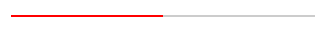
currentProgress
| prop | type | default | | :-------------- | :----- | :------ | | currentProgress | Number | 0 |
<stepsProgress :currentProgress='50' />
lineBackground
<stepsProgress
:currentProgress='50'
lineBackgroundColor='#ccc'
lineForeground='green'
/>
| | | | | :------------------ | ------ | -------- | | prop | type | default | | lineBackgroundColor | String | #dcdcdc | | lineForeground | String | #019879 |
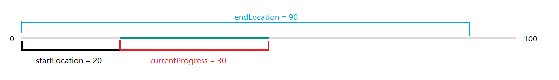
startLocation && endLocation
<stepsProgress
:currentProgress='30'
:startLocation='20'
:endLocation='90'
></stepsProgress>
| | | | | :------------ | ------ | ------- | | prop | type | default | | startLocation | Number | 0 | | endLocation | Number | 100 |
startLocation 是整个进度条起始的百分比位置
StartLocation is the percentage of the start of the entire progress bar
endLocation 是整个进度条结束的百分比位置
EndLocation is the percentage of the end of the entire progress bar
currentProgress 是 startLocation 至 endLocation 中间的百分比
CurrentProgress is the percentage between startLocation and endLocation
demo-1-step
<stepsProgress
    :currentProgress='30'
    :steps="[{
    progress: 0,
    showRound: true,
    text: 'Have to declare'
    },{
    progress: 100,
    showRound: true,
    text: 'completed'
    }]"
    :currentStep='1'
    roundWidth='1.5em'
></stepsProgress>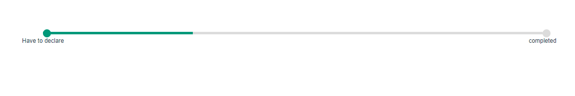
| prop | type | default | | ----------- | ------ | ------- | | steps | Array | | | currentStep | Number | 0 | | roundWidth | string | 1em |
roundWidth
圆半径 Circle radius
currentStep
currentStep 是 当前进行到step的下标, currentStep之前的圆点会点亮。
CurrentStep is the subscript of the currentStep, and the dots before currentStep will be lit.
steps
<stepsProgress
:steps="[{
    progress: 100,
    // 当前圆点距离整个进度条的left位置, 范围:0-100
    // The left position between the current dot and the progress bar (range :0-100)

    showRound: true, // 显示圆点  According to dot

    text: 'completed', // 圆点下方的文字,没有则不显示  The text below the dot,If no, no display
    foreground: 'red', // 圆点点亮的颜色  Dot light color
    backgroundColor: '#000', // 圆点背景色 Dot background color
}]"
></stepsProgress>
demo2
<stepsProgress
    :currentProgress='90'
    :steps="[{
        progress: 10,
        showRound: true,
        text: 'Have to declare'
        },{
        progress: 25,
        showRound: true,
        text: 'Have been concluded'
        },{
        progress: 90,
        showRound: true,
        text: 'completed'
    }]"
    :startLocation='25'
    :endLocation='90'
    :currentStep='2'
></stepsProgress>
demo3-slot
<template>
  <div class="demo">
    <stepsProgress
    :currentProgress='currentProgress'
    :steps="[{
      progress: 10,
      showRound: true,
      text: 'Have to declare'
    },{
      progress: 25,
      showRound: true,
      text: 'Have been concluded'
    },{
      progress: 58,
      showRound: false,
      text: 'under construction'
    },{
      progress: 90,
      showRound: true,
      text: 'completed'
    }]"
    :startLocation='25'
    :endLocation='90'
    :currentStep='2'
    >
      <template>
        <div class="slot-currentProgress">
          {{currentProgress}}
        </div>
      </template>
      <template #text='{item}'>
        <span v-if="item.text == 'under construction'" class="text">
          {{item.text}} <span style="color:red">icon</span>
        </span>
        <span v-else class="text">
          {{item.text}}
        </span>
      </template>
    </stepsProgress>
  </div>
</template>
<script>
import stepsProgress from 'vue2-steps-progress'
export default {
  components: {
    stepsProgress,
  },
  data() {
    return {
      currentProgress: 10
    }
  },
}
</script>
<style scoped>
.demo{
  width: 1000px;
  height: 50px;
  margin: 100px auto;
}
.slot-currentProgress{
  position: relative;
  background-color: rgb(1, 152, 121);
  width: 2em;
  border-radius: 50%;
  line-height: 2;
  color: white;
}
.slot-currentProgress::before{
  content: '';
  position: absolute;
  bottom: -.2em;
  left: 50%;
  width: 1em;
  height: 1em;
  background-color: inherit;
  z-index: -1;
  transform:  translateX(-50%) rotate(-45deg);
}
.text{
  position: absolute;
  font-size: 0.16rem;
  top: 120%;
  left: 50%;
  transform: translateX(-50%);
  white-space: nowrap;
}
</style>