
vue3-confirm-dialog-box
v1.1.4
Published
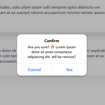
A modern, accessible confirmation dialog plugin for Vue 3 with TypeScript support
Maintainers
 anilshr90
Readme
vue3-confirm-dialog-box
A modern, accessible, and customizable confirmation dialog plugin for Vue 3 applications.
Features
- ✅ Vue 3 Composition API - Built with modern Vue 3 patterns
- ✅ TypeScript Support - Full type definitions included
- ✅ Accessible - WCAG compliant with proper ARIA labels and keyboard navigation
- ✅ Promise & Callback API - Support both modern promises and traditional callbacks
- ✅ Customizable - Easy theming with CSS custom properties
- ✅ Focus Management - Automatic focus trapping and restoration
- ✅ Mobile Friendly - Responsive design with touch support
- ✅ Dark Mode - Automatic dark mode detection
- ✅ Password Protection - Optional password confirmation
- ✅ SSR Compatible - Works with Nuxt.js and other SSR frameworks
Installation
npm install vue3-confirm-dialog-box
# or
yarn add vue3-confirm-dialog-box
# or
pnpm add vue3-confirm-dialog-box
Quick Start
1. Register the Plugin
// main.js
import { createApp } from "vue";
import Vue3ConfirmDialogBox from "vue3-confirm-dialog-box";
import "vue3-confirm-dialog-box/style";

const app = createApp(App);
app.use(Vue3ConfirmDialogBox);
2. Add the Component to Your App
<!-- App.vue -->
<template>
  <div id="app">
    <vue3-confirm-dialog-box />
    <!-- Your app content -->
  </div>
</template>
3. Use in Your Components
Options API:
export default {
  methods: {
    async handleDelete() {
      const result = await this.$confirm({
        title: "Delete Item",
        message: "Are you sure you want to delete this item? This action cannot be undone.",
        button: {
          no: "Cancel",
          yes: "Delete"
        }
      });

      if (result.confirmed) {
        // User clicked "Delete"
        console.log("Item deleted");
      }
    }
  }
}
Composition API:
import { inject } from "vue";

export default {
  setup() {
    const confirm = inject('vue3-confirm-dialog-box');

    const handleDelete = async () => {
      try {
        const result = await confirm({
          title: "Delete Item",
          message: "Are you sure you want to delete this item?",
          button: {
            no: "Cancel",
            yes: "Delete"
          }
        });

        if (result.confirmed) {
          console.log("Confirmed!");
        }
      } catch (error) {
        console.error("Dialog error:", error);
      }
    };

    return { handleDelete };
  }
}
Script Setup:
<script setup>
import { inject } from 'vue';

const confirm = inject('vue3-confirm-dialog-box');

async function handleAction() {
  const { confirmed } = await confirm({
    title: "Confirm Action",
    message: "Do you want to proceed?",
  });

  if (confirmed) {
    // Handle confirmation
  }
}
</script>
API Reference
Configuration Options
| Option | Type | Default | Description |
|--------|------|---------|-------------|
| title | string | "Confirm" | Dialog title |
| message | string | "Are you sure?" | Dialog message content |
| button.yes | string | "Yes" | Confirm button text |
| button.no | string | "Cancel" | Cancel button text |
| auth | boolean | false | Enable password confirmation |
| authPlaceholder | string | "Password" | Password input placeholder |
| callback | function | undefined | Legacy callback function |
Return Value (Promise)
{
  confirmed: boolean, // true if user clicked confirm, false if cancelled
  password: string    // password value if auth is enabled
}
Methods
$confirm(options) / confirm(options)
Shows the confirmation dialog and returns a promise.
$confirm.close() / confirm.close()
Programmatically closes the dialog.
$confirm.setDefaults(defaults)
Sets default options for all future dialogs.
this.$confirm.setDefaults({
  button: {
    yes: "OK",
    no: "Cancel"
  }
});
Advanced Usage
Password Protection
const result = await this.$confirm({
  title: "Dangerous Action",
  message: "Please enter your password to continue",
  auth: true,
  authPlaceholder: "Enter password",
  button: {
    no: "Cancel",
    yes: "Confirm"
  }
});

if (result.confirmed) {
  console.log("Password:", result.password);
}
Custom Button Labels
await this.$confirm({
  title: "Save Changes",
  message: "Do you want to save your changes before leaving?",
  button: {
    no: "Discard",
    yes: "Save"
  }
});
Single Button Dialog
await this.$confirm({
  title: "Information",
  message: "Your changes have been saved successfully!",
  button: {
    no: null, // Hide cancel button
    yes: "OK"
  }
});
Legacy Callback API
this.$confirm({
  title: "Legacy Support",
  message: "This still works with callbacks",
  callback: (confirmed, password) => {
    if (confirmed) {
      console.log("Confirmed with password:", password);
    }
  }
});
Event Listeners
<template>
  <vue3-confirm-dialog-box
    @confirm="onConfirm"
    @cancel="onCancel"
  />
</template>

<script>
export default {
  methods: {
    onConfirm(result) {
      console.log("Confirmed:", result);
    },
    onCancel(result) {
      console.log("Cancelled:", result);
    }
  }
}
</script>
Customization
CSS Custom Properties
You can customize the appearance using CSS custom properties:
:root {
  --vc-title-color: #1a1a1a;
  --vc-message-color: #4a4a4a;
  --vc-overlay-background-color: rgba(0, 0, 0, 0.5);
  --vc-base-background-color: #ffffff;
  --vc-button-color: #007bff;
  --vc-button-background-color: #ffffff;
  --vc-button-border-color: #e0e0e0;
  --vc-primary-button-background: #007bff;
  --vc-primary-button-color: #ffffff;
  --vc-input-background-color: #f8f9fa;
  --vc-input-border-color: #dee2e6;
  --vc-border-radius: 12px;
  --vc-font-size-base: 16px;
}

/* Custom theme example */
.my-app {
  --vc-title-color: #2c3e50;
  --vc-button-color: #e74c3c;
  --vc-primary-button-background: #e74c3c;
  --vc-border-radius: 8px;
}
Component Styling
Override component classes for more granular control:
.vc-container {
  /* Custom container styles */
  min-width: 320px;
}

.vc-title {
  /* Custom title styles */
  font-family: 'Inter', sans-serif;
}

.vc-btn {
  /* Custom button styles */
  text-transform: uppercase;
  letter-spacing: 0.5px;
}
Accessibility Features
- Keyboard Navigation: Full keyboard support with Tab, Enter, and Escape keys
- Focus Management: Automatic focus trapping and restoration
- Screen Reader Support: Proper ARIA labels and semantic HTML
- High Contrast: Supports system high contrast modes
- Reduced Motion: Respects
prefers-reduced-motionsettings
Keyboard Shortcuts
| Key | Action |
|-----|--------|
| Tab / Shift+Tab | Navigate between buttons |
| Enter | Confirm action |
| Escape | Cancel/close dialog |
| Space | Activate focused button |
TypeScript Support
Full TypeScript definitions are included:
interface ConfirmOptions {
  title?: string;
  message?: string;
  button?: {
    yes?: string;
    no?: string | null;
  };
  auth?: boolean;
  authPlaceholder?: string;
  callback?: (confirmed: boolean, password?: string) => void;
}

interface ConfirmResult {
  confirmed: boolean;
  password?: string;
}

declare function confirm(options?: ConfirmOptions): Promise<ConfirmResult>;
Framework Integration
Nuxt.js Plugin
Create plugins/confirm-dialog.client.js:
import Vue3ConfirmDialogBox from "vue3-confirm-dialog-box";
import "vue3-confirm-dialog-box/style";

export default defineNuxtPlugin((nuxtApp) => {
  nuxtApp.vueApp.use(Vue3ConfirmDialogBox);
});
Quasar Framework
// quasar.config.js
module.exports = configure(function (ctx) {
  return {
    boot: ['confirm-dialog'],
    // ... other config
  }
})

// boot/confirm-dialog.js
import { boot } from 'quasar/wrappers';
import Vue3ConfirmDialogBox from "vue3-confirm-dialog-box";
import "vue3-confirm-dialog-box/style";

export default boot(({ app }) => {
  app.use(Vue3ConfirmDialogBox);
});
Vite/Webpack Bundle Optimization
For optimal bundle size, you can import only what you need:
// Import component and styles separately
import { Vue3ConfirmDialogBox } from "vue3-confirm-dialog-box/components";
import "vue3-confirm-dialog-box/dist/style.css";

app.component('ConfirmDialog', Vue3ConfirmDialogBox);
Testing
Unit Tests
// Example with Vue Test Utils
import { mount } from '@vue/test-utils';
import Vue3ConfirmDialogBox from 'vue3-confirm-dialog-box';

describe('ConfirmDialog', () => {
  it('shows dialog with correct title', async () => {
    const wrapper = mount(Vue3ConfirmDialogBox);

    // Trigger dialog
    wrapper.vm.open({
      title: 'Test Title',
      message: 'Test Message'
    });

    await wrapper.vm.$nextTick();

    expect(wrapper.find('.vc-title').text()).toBe('Test Title');
  });
});
E2E Tests
// Example with Playwright
test('confirm dialog workflow', async ({ page }) => {
  await page.goto('/');

  // Click button that opens dialog
  await page.click('[data-testid="delete-button"]');

  // Check dialog appears
  await expect(page.locator('[role="dialog"]')).toBeVisible();

  // Click confirm
  await page.click('text=Delete');

  // Verify action was taken
  await expect(page.locator('.success-message')).toBeVisible();
});
Migration Guide
From v1.0.0 to v1.1.0
The main breaking changes involve the inject key and improved API:
Before:
const confirm = inject("vue3-confirm-dialog");After:
const confirm = inject("vue3-confirm-dialog-box");
// or the shorter alias
const confirm = inject("confirm");
New Promise API:
// Old callback style (still supported)
this.$confirm({
  title: "Test",
  callback: (result) => console.log(result)
});

// New promise style (recommended)
const result = await this.$confirm({
  title: "Test"
});
console.log(result.confirmed);
Troubleshooting
Common Issues
Dialog not showing:
- Ensure the component is added to your template
- Check for CSS conflicts with z-index
- Verify the plugin is properly registered
Styling issues:
- Import the CSS file:
import "vue3-confirm-dialog-box/style" - Check for CSS custom property conflicts
- Ensure Teleport target (body) is available
TypeScript errors:
- Install latest version which includes type definitions
- Add proper type imports in your components
SSR hydration mismatches:
- Use
.client.jssuffix for Nuxt plugins - Ensure component is wrapped in
<ClientOnly>if needed
Performance Tips
- Use
v-ifinstead ofv-showfor conditional rendering - Import styles only once at the application level
- Consider lazy loading for large applications
Contributing
We welcome contributions! Please see our Contributing Guide for details.
Development Setup
# Clone the repository
git clone https://github.com/anilshr25/vue3-confirm-dialog-box.git

# Install dependencies
npm install

# Start development server
npm run dev

# Run tests
npm run test

# Build for production
npm run build
License
MIT © Anil Shrestha
Changelog
v1.1.0
- ✅ Added full accessibility support
- ✅ Promise-based API alongside callback support
- ✅ Improved focus management and keyboard navigation
- ✅ TypeScript definitions included
- ✅ Better error handling and validation
- ✅ Dark mode support
- ✅ Memory leak fixes
- ✅ Enhanced styling and theming options
v1.0.1
- 🐛 Fixed component registration issues
- 🐛 Improved bundle size
v1.0.0
- 🎉 Initial release