
vue3-mycalendar
v0.7.3
Published
A calendar and scheduling package for Vue 3
Maintainers
 michael.brilz89
Keywords
Readme
vue3-mycalendar
A powerful and customizable calendar component for Vue 3 with drag & drop support, custom forms, popups, and full theming capabilities.


✨ Features
- 📅 Weekly calendar view with hour grid
- 🖱️ Drag & drop events between days and times
- 📝 Customizable event forms via Scoped Slots
- 🎨 Full theming with CSS variables
- 🌙 Built-in Light & Dark mode
- 📋 Event popups with todos & participants
- 🔧 TypeScript support
Installation
npm install vue3-mycalendarQuick Start
<template>
  <ScheduleForm
    :schedules="schedules"
    :additional-fields="additionalFields"
    custom-class="my-calendar"
    :labels-and-settings="labelsAndSettings"
    :popup-fields="popupFields"
    @submit-event="handleNewEvent"
    @handle-delete="handleDeleteEvent"
    @update-event="handleUpdateEvent"
  />
</template>

<script setup lang="ts">
import { ref, computed } from 'vue';
import { ScheduleForm } from 'vue3-mycalendar';
import 'vue3-mycalendar/dist/style.css';

const schedules = ref([
  {
    id: 1,
    title: 'Meeting',
    date: '2025-07-04',
    start: '09:00',
    end: '10:00',
    color: '#e2Be33',
    teacher: 'Malika Heaney',
    room: 'Room 1',
    todos: ['Prepare agenda', 'Print documents'],
    participants: ['Malika', 'Jonas']
  },
  {
    id: 2,
    title: 'Workshop',
    date: '2025-07-04',
    start: '13:00',
    end: '15:00',
    color: '#33C3FF',
    teacher: 'John Doe',
    room: 'Room 2'
  },
]);

const additionalFields = ref([
  { id: 'title', label: 'Title', type: 'text', model: 'title' },
  { id: 'teacher', label: 'Teacher', type: 'text', model: 'teacher' },
  {
    id: 'room',
    label: 'Room',
    type: 'select',
    model: 'room',
    options: [
      { id: 1, name: 'Room 1' },
      { id: 2, name: 'Room 2' }
    ]
  },
]);

const popupFields = ref(['title', 'date', 'start', 'end', 'teacher', 'room']);

const labelsAndSettings = computed(() => ({
  startTimeLabel: 'Start Time',
  endTimeLabel: 'End Time',
  dateLabel: 'Date',
  submitButtonText: 'Add Event',
  calendarWeekLabel: 'Week',
  todosLabel: 'To-Do',
  participantsLabel: 'Participants',
}));

const handleNewEvent = (event) => {
  const newId = Math.max(...schedules.value.map(e => e.id), 0) + 1;
  schedules.value.push({ ...event, id: newId });
};

const handleDeleteEvent = (id) => {
  schedules.value = schedules.value.filter(event => event.id !== id);
};

const handleUpdateEvent = (updatedEvent) => {
  const index = schedules.value.findIndex(e => e.id === updatedEvent.id);
  if (index !== -1) {
    schedules.value[index] = updatedEvent;
  }
};
</script>

<style>
.my-calendar {
  --form-bg-color: #f8fafc;
  --button-bg-color: #3b82f6;
  --label-color: #334155;
}
</style>
🎨 Custom Form Slot
Replace the default form with your own design using the form slot. You get full access to the internal state and methods via Scoped Slot Props.
Slot Props
| Prop | Type | Description |
|------|------|-------------|
| newEvent | Ref<Partial<EventInfo>> | Reactive event object for v-model binding |
| addEvent | (event?: Partial<EventInfo>) => void | Submit function to add the event |
| additionalFields | Field[] | Configured additional fields array |
| labels | LabelsAndSettings | All label texts and settings |
| resetForm | () => void | Reset form to initial state |
Example: Custom Styled Form
<template>
  <ScheduleForm
    :schedules="schedules"
    :additional-fields="additionalFields"
    @submit-event="handleNewEvent"
  >
    <template #form="{ newEvent, addEvent, labels, resetForm }">
      <div class="custom-form">
        <h3>📅 Create New Event</h3>

        <div class="form-grid">
          <input
            v-model="newEvent.title"
            type="text"
            placeholder="Event title..."
            class="input-field"
          />

          <input
            v-model="newEvent.date"
            type="date"
            class="input-field"
          />

          <div class="time-row">
            <input v-model="newEvent.start" type="time" class="input-field" />
            <span>to</span>
            <input v-model="newEvent.end" type="time" class="input-field" />
          </div>

          <select v-model="newEvent.room" class="input-field">
            <option value="">Select room...</option>
            <option value="Room 1">Room 1</option>
            <option value="Room 2">Room 2</option>
          </select>

          <input
            v-model="newEvent.color"
            type="color"
            class="color-picker"
          />
        </div>

        <div class="form-actions">
          <button type="button" @click="resetForm" class="btn-secondary">
            Reset
          </button>
          <button type="button" @click="addEvent()" class="btn-primary">
            {{ labels.submitButtonText }}
          </button>
        </div>
      </div>
    </template>
  </ScheduleForm>
</template>

<style scoped>
.custom-form {
  background: linear-gradient(135deg, #667eea 0%, #764ba2 100%);
  padding: 24px;
  border-radius: 16px;
  margin-bottom: 20px;
  color: white;
}

.custom-form h3 {
  margin: 0 0 20px 0;
  font-size: 1.25rem;
}

.form-grid {
  display: flex;
  flex-direction: column;
  gap: 12px;
}

.time-row {
  display: flex;
  align-items: center;
  gap: 12px;
}

.input-field {
  padding: 12px 16px;
  border: none;
  border-radius: 8px;
  font-size: 14px;
  background: rgba(255, 255, 255, 0.95);
}

.color-picker {
  width: 60px;
  height: 40px;
  border: none;
  border-radius: 8px;
  cursor: pointer;
}

.form-actions {
  display: flex;
  gap: 12px;
  margin-top: 20px;
}

.btn-secondary {
  padding: 12px 24px;
  background: rgba(255, 255, 255, 0.2);
  border: none;
  border-radius: 8px;
  color: white;
  cursor: pointer;
  transition: background 0.2s;
}

.btn-secondary:hover {
  background: rgba(255, 255, 255, 0.3);
}

.btn-primary {
  flex: 1;
  padding: 12px 24px;
  background: white;
  border: none;
  border-radius: 8px;
  color: #764ba2;
  font-weight: 600;
  cursor: pointer;
  transition: transform 0.2s;
}

.btn-primary:hover {
  transform: translateY(-2px);
}
</style>
Example: Minimal Form (Only Required Fields)
<template>
  <ScheduleForm :schedules="schedules" :additional-fields="[]">
    <template #form="{ newEvent, addEvent }">
      <div class="minimal-form">
        <input v-model="newEvent.title" placeholder="Title" />
        <input v-model="newEvent.date" type="date" />
        <input v-model="newEvent.start" type="time" />
        <input v-model="newEvent.end" type="time" />
        <button @click="addEvent()">Add</button>
      </div>
    </template>
  </ScheduleForm>
</template>
Example: No Form (Calendar Only)
<template>
  <ScheduleForm :schedules="schedules" :additional-fields="[]">
    <!-- Empty slot removes the form completely -->
    <template #form></template>
  </ScheduleForm>
</template>
🪟 Custom Popup Slot
Customize the event details popup with the popup-calendar slot.
<template>
  <ScheduleForm
    :schedules="schedules"
    :additional-fields="additionalFields"
    :popup-visible="isPopupVisible"
    :popup-event="selectedEvent"
    @show-info="openPopup"
    @close-popup="closePopup"
  >
    <template #popup-calendar>
      <div v-if="isPopupVisible && selectedEvent" class="my-popup-overlay">
        <div class="my-popup">
          <h2>{{ selectedEvent.title }}</h2>
          <p>📅 {{ selectedEvent.date }}</p>
          <p>🕐 {{ selectedEvent.start }} - {{ selectedEvent.end }}</p>
          <p>📍 {{ selectedEvent.room }}</p>

          <button @click="closePopup">Close</button>
        </div>
      </div>
    </template>
  </ScheduleForm>
</template>

<script setup>
const isPopupVisible = ref(false);
const selectedEvent = ref(null);

const openPopup = (event) => {
  selectedEvent.value = event;
  isPopupVisible.value = true;
};

const closePopup = () => {
  isPopupVisible.value = false;
  selectedEvent.value = null;
};
</script>
📋 Props
Required Props
| Prop | Type | Description |
|------|------|-------------|
| schedules | EventInfo[] | Array of events to display on the calendar |
| additionalFields | Field[] | Additional fields for the event form |
Optional Props
| Prop | Type | Default | Description |
|------|------|---------|-------------|
| customClass | string | '' | Custom CSS class for styling |
| customStyles | Record<string, any> | {} | Inline styles for the root element |
| weekdays | string[] | ['Monday', ...] | Custom weekday names |
| eventTitleColor | string | '#000' | Event title text color |
| eventTitleSize | string | '16px' | Event title font size |
| popupFields | string[] | [] | Fields to show in the default popup |
| labelsAndSettings | LabelsAndSettings | See below | Labels and text customization |
| placeholderSettings | object | {} | Placeholder texts for popup inputs |
| popupVisible | boolean | false | Control popup visibility externally |
| popupEvent | EventInfo \| null | null | Current event for the popup |
Labels and Settings
interface LabelsAndSettings {
  startTimeLabel?: string;      // Default: 'Start Time'
  endTimeLabel?: string;        // Default: 'End Time'
  dateLabel?: string;           // Default: 'Date'
  submitButtonText?: string;    // Default: 'Add Entry'
  calendarWeekLabel?: string;   // Default: 'CW'
  todosLabel?: string;          // Default: 'To-Do'
  participantsLabel?: string;   // Default: 'Teammates'
}
📡 Events
| Event | Payload | Description |
|-------|---------|-------------|
| submit-event | EventInfo | New event submitted via form |
| update-event | EventInfo | Event updated (drag & drop or edit) |
| handle-delete | number | Event ID to delete |
| show-info | EventInfo | Event details requested |
| close-popup | – | Popup closed |
| update:todos | { todos: string[], eventId: number } | Todos changed |
| update:participants | { participants: string[], eventId: number } | Participants changed |
🎭 Slots
| Slot | Scoped Props | Description |
|------|--------------|-------------|
| form | { newEvent, addEvent, additionalFields, labels, resetForm } | Custom event form |
| popup-calendar | – | Custom popup for event details |
📊 Type Definitions
EventInfo
interface EventInfo {
  id: number;
  title: string;
  date: string;           // Format: 'YYYY-MM-DD'
  start: string;          // Format: 'HH:MM'
  end: string;            // Format: 'HH:MM'
  color: string;          // Hex color, e.g. '#3b82f6'
  info?: string;
  todos?: string[];
  participants?: string[];
  [key: string]: any;     // Additional custom fields
}
Field
interface Field {
  id: string;
  label: string;
  type: 'text' | 'select' | 'date' | 'time' | 'number';
  model: string;
  options?: { id: number | string; name: string }[];
}
🎨 Styling
CSS Variables
Override these variables via customClass:
<ScheduleForm custom-class="my-calendar" ... />.my-calendar {
/* Form */
--form-bg-color: #ffffff;
--form-padding: 1rem;
--form-border-radius: 8px;
--form-border: 1px solid #ccc;
/* Labels */
--label-color: #333333;
--label-font-weight: bold;
/* Inputs */
--input-height: 40px;
--input-padding: 0.5rem;
--input-font-size: 1rem;
--input-border: 1px solid #ccc;
--input-border-radius: 6px;
--input-bg-color: #ffffff;
--input-color: #000000;
/* Buttons */
--button-bg-color: #007bff;
--button-hover-bg-color: #0056b3;
--button-color: #ffffff;
--button-padding: 0.6rem 1rem;
--button-border-radius: 6px;
/* Calendar */
--calendar-primary-color: #a4d8ff;
--grid-border-color: #cccccc;
--event-border-radius: 8px;
/* Navigation */
--arrow-button-bg: #007bff;
--arrow-button-color: #ffffff;
--current-week-color: #000000;
/* Popup */
--popup-bg: #ffffff;
--popup-overlay-bg: rgba(0, 0, 0, 0.5);
--popup-border-radius: 5px;
/* Danger */
--danger-bg: #e53e3e;
--danger-text: #ffffff;
}Dark Mode
Option A: Per Component
<ScheduleForm :custom-class="isDark ? 'my-calendar dark' : 'my-calendar'" ... />Option B: Global (affects entire page)
// Enable dark mode
document.documentElement.classList.add('dark');

// Disable dark mode
document.documentElement.classList.remove('dark');
Theme Toggle Example
<script setup>
import { ref, computed, onMounted } from 'vue';
const isDark = ref(false);
const syncTheme = () => {
document.documentElement.classList.toggle('dark', isDark.value);
};
const toggleTheme = () => {
isDark.value = !isDark.value;
syncTheme();
};
onMounted(() => {
// Initialize from system preference
isDark.value = window.matchMedia('(prefers-color-scheme: dark)').matches;
syncTheme();
});
const calendarClass = computed(() =>
isDark.value ? 'my-calendar dark' : 'my-calendar'
);
</script>
<template>
<button @click="toggleTheme">
{{ isDark ? '☀️ Light' : '🌙 Dark' }}
</button>
<ScheduleForm :custom-class="calendarClass" ... />
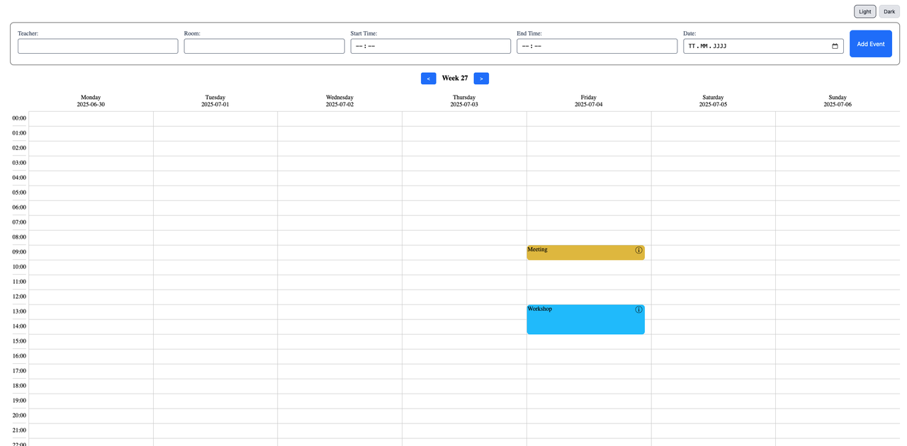
</template>📸 Screenshots
Light Mode
Dark Mode

🗺️ Roadmap
- Quickly jump back to the current week
- Visual indicator for the current day
- Click on empty cell to create a new event
- Full month overview with event indicators
🤝 Contributing
Contributions are welcome! Please open an issue or submit a pull request.
👨💻 About Me
I'm a motivated developer working as a full-stack engineer in the cloud department of a cybersecurity company. I'm dedicated to building secure and robust applications while continuously expanding my skills.
📄 License
💬 Support
If you have questions or need help, please open an issue.