
vuetiwatch
v0.2.4
Published
Nineteen free, plug-and-play Vuetify 4 themes for Vue 3 apps — what Bootswatch is to Bootstrap

Maintainers
 j-tap
j-tapReadme
Vuetiwatch — free Vuetify themes



🎨 Nineteen free, plug-and-play Vuetify themes for Vuetify 4 and any Vue 3 app — what Bootswatch is to Bootstrap.
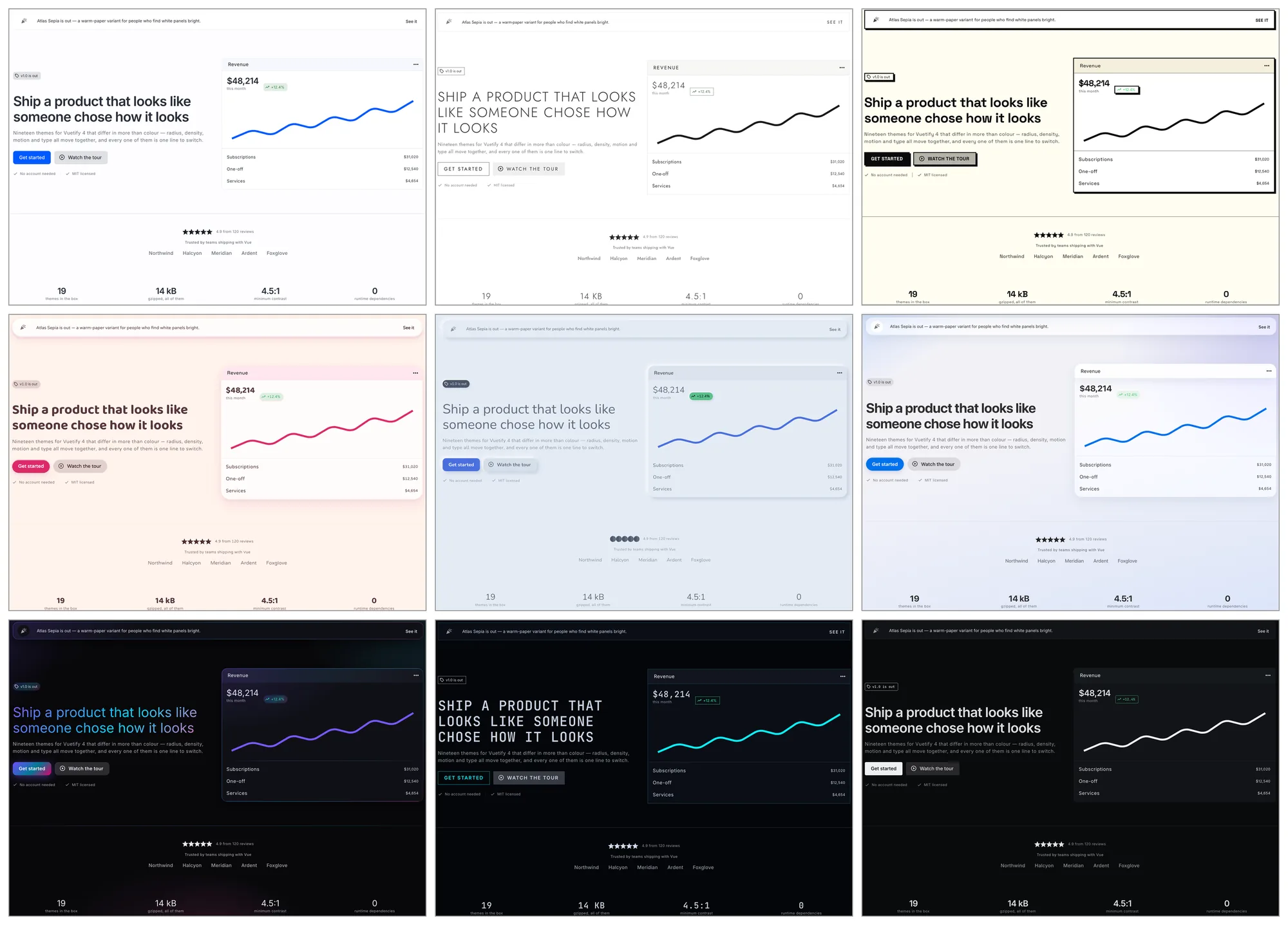
Preview all nineteen Vuetify themes →
Vuetify ships one look. Vuetiwatch ships nineteen, and they differ in more than hue: radius, border weight, density, component variants, typography, icons and motion all move together.
npm i vuetiwatch # or: bun add / yarn add / pnpm addThemes
| Name | Mode | Character |
| --- | --- | --- |
| classic | light | Stock Vuetify. Material Design, Roboto, familiar elevation |
| paper | light | Flat editorial — warm paper, ink accents, hairline borders, serif headings |
| slate | light | Dense dashboard — muted slate blue, compact density, outlined cards |
| atlas | light | Calm admin — soft neutrals, one cool accent, dense tables, hairlines not shadows |
| atlasDark | dark | The same panel after dark — soft greys, never pure black |
| atlasSepia | light | The same panel on warm paper and brown ink, for tired eyes |
| calm | light | Low contrast, desaturated naturals, no shadows, a lot of air |
| lux | light | Editorial luxury — hairline rules, wide tracking, small caps, muted gold |
| soft | light | Pastel and generous — large radii, diffuse tinted shadows, hearts for stars |
| candy | light | Plush and pillowy — warm cream, padded shapes, controls that squash |
| clay | light | Inflated pastel shapes with a triple shadow. Toy-like |
| morph | light | Neumorphic — one continuous surface, shaped only by light and shadow |
| sketchy | light | Hand-drawn wobble and pencil greys, for mockups and mirth |
| brutalist | light | Thick black rules, acid lime, hard unblurred shadows |
| liquidGlass | light | Capsule controls and refracting panes over a calm wash, after iOS 26 |
| darkGlass | dark | Frosted translucent surfaces on a deep violet ground |
| aurora | dark | Iridescent gradients on near-black — the showcase theme |
| neon | dark | Terminal black, cyan and magenta glow, zero radius, monospace headings |
classic is the control. It opts out of the core stylesheet entirely — not
one rule in this package matches a page running it — so switching to it
shows exactly what the other eighteen add.
How to install and apply a theme in Vuetify 4
Register the themes in createVuetify, then add the plugin. defaultTheme
picks the one that loads; useTheme().change(name) switches at runtime.
1. Register the themes. They are plain Vuetify ThemeDefinitions.
// plugins/vuetify.ts
import { createVuetify } from 'vuetify'
import { vuetiwatchThemes } from 'vuetiwatch'

import 'vuetify/styles'
import 'vuetiwatch/styles.css'

export const vuetify = createVuetify({
  theme: { defaultTheme: 'paper', themes: vuetiwatchThemes },
})
2. Install the plugin, after Vuetify.
// main.ts
import { createVuetiwatch, themeList } from 'vuetiwatch'

createApp(App)
  .use(vuetify)
  .use(createVuetiwatch(vuetify, { themes: themeList }))
  .mount('#app')
That is the whole setup. Step 1 alone gives you colours and fonts; the
stylesheet and the plugin add everything a ThemeDefinition cannot express —
radius, border weight, component variants, icons and per-theme surface
treatment.
The plugin swaps Vuetify's global component defaults when the theme
changes, since those are global rather than per-theme. Your own
createVuetify({ defaults }) is preserved; theme defaults layer on top. It
also exposes useVuetiwatch() — see switching themes —
and accepts defaults, attribute and transitions to turn any of it off.
Switching themes
Vuetify's own theme.change() works as it always did. The plugin adds one
thing on top of it:
<script setup lang="ts">
import { useVuetiwatch } from 'vuetiwatch'

const { themes, current, change } = useVuetiwatch()
</script>

<template>
  <button v-for="t in themes" :key="t.name" @click="change(t.name, $event)">
    {{ t.meta.title }}
  </button>
</template>
useVuetiwatch() also returns siblings: the variants of the theme that is
running, or an empty array when it has none. A theme declares what it belongs
to through meta.family, so a light/dark switch never has to know which
themes go together:
<script setup lang="ts">
const { siblings, current, change } = useVuetiwatch()
</script>

<template>
  <v-btn-toggle v-if="siblings.length > 1" :model-value="current?.name">
    <v-btn
      v-for="t in siblings"
      :key="t.name"
      :value="t.name"
      :text="t.meta.variant"
      @click="change(t.name, $event)"
    />
  </v-btn-toggle>
</template>
A theme can also offer accents — named colour sets it repaints itself
in, declared in meta.accents and applied through setAccent():
<script setup lang="ts">
const { accents, accent, setAccent } = useVuetiwatch()
</script>

<template>
  <button
    v-for="item in accents"
    :key="item.id"
    :style="{ background: item.colors.primary }"
    @click="setAccent(item.id)"
  />
</template>
Presets rather than a colour picker: every one is measured against the theme's ground, and the id is shared across the family, so the choice survives a light/dark switch.
Pass the event and the new theme opens as a circle from the control that was
pressed, through the View Transitions API — Baseline since October 2025.
Where the API is missing, where the visitor asked for reduced motion, or
where you passed transitions: false, the same call switches instantly, so
it is always safe to use. Each theme sets its own pace through
vw-theme-transition: neon repaints in 180 ms, calm takes 560.
Motion
Movement is the fourth axis these themes travel on, after colour, shape and
type. brutalist snaps in two steps, lux eases over a quarter-second,
candy overshoots and settles — and a checkbox, a toggle button or a rating
star pops when it turns on, the way a like button does.
None of it costs a byte of JavaScript: themes state a character in a handful
of variables and the core layer spends it on the same interactions
everywhere. Only transform is animated, so it stays on the compositor.
prefers-reduced-motion: reduce zeroes the variables themselves in one
place, which covers every theme at once — including one you wrote yourself.
Fonts
Themes name the families they want but never load them — that stays your
call. meta.fonts lists what each expects, and every family has a system
fallback, so skipping this degrades gracefully rather than breaking.
<link rel="stylesheet"
      href="https://fonts.googleapis.com/css2?family=Nunito:wght@400;600;700&display=swap">
Shipping only a few themes
Pass just those to the plugin and import their stylesheets instead of the combined one. The whole stylesheet is about 6.6 kB gzipped; the core layer plus one theme is under 3 kB.
import { createVuetiwatch, paper } from 'vuetiwatch'
import 'vuetiwatch/styles/core.css'
import 'vuetiwatch/styles/paper.css'

app.use(createVuetiwatch(vuetify, { themes: [paper] }))
core.css is always needed. A theme file exists only where a theme needs
more than its ThemeDefinition can express, so classic has none. Every
file also ships as *.min.css.
Writing your own theme
defineTheme() takes a name, the meta a picker needs, a Vuetify
ThemeDefinition and the component defaults that go with it; everything left
out is inherited from Vuetify's own light or dark. Register it alongside
the rest, and it behaves like a theme that shipped with the package —
including the switch animation and the light/dark family.
Documentation
- Writing your own theme —
defineTheme, overlay transitions, text selection, per-theme icons - Theme variables — every
vw-*custom property the stylesheet reads, and what it moves - What wins — props, theme defaults, your defaults, Vuetify, and where your own CSS lands
- Contrast — how the palettes are measured against WCAG 2 and APCA, and the one stated exception
Requirements
- Vuetify 4.0+. v3 is not supported: runtime font switching
(
--v-font-body,--v-font-heading) andshadow-colorexist only in v4, and without them the themes lose most of what separates them. - Vue 3.5+
License
MIT