
vuex-table
v2.0.0
Published
> Vuex-table is a Vue component created in order to easily fit in any Vue (even Vuex or Typescript) project. > It consists on a table representation of informations whose data can be provided both from frontend or backend.


Readme
Vuex-table
Vuex-table is a Vue component created in order to easily fit in any Vue (even Vuex or Typescript) project. It consists on a table representation of informations whose data can be provided both from frontend or backend.
NEW ! Vuex-table is now coded on Vue.js and Typescript (see Documentation)
Features ⚙
Sorting
Rows can be sorted according to column field (ex. sorting names alphabetically )
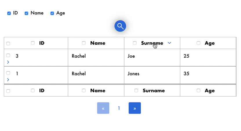
Selection
Rows can checked one by one or all at once by clicking on checkbox.
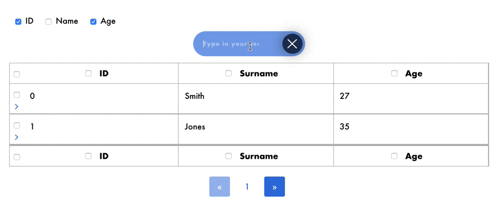
Search
Rows which match with user input in searchbar will be displayed, so that user can easily find the information he/she is looking for.
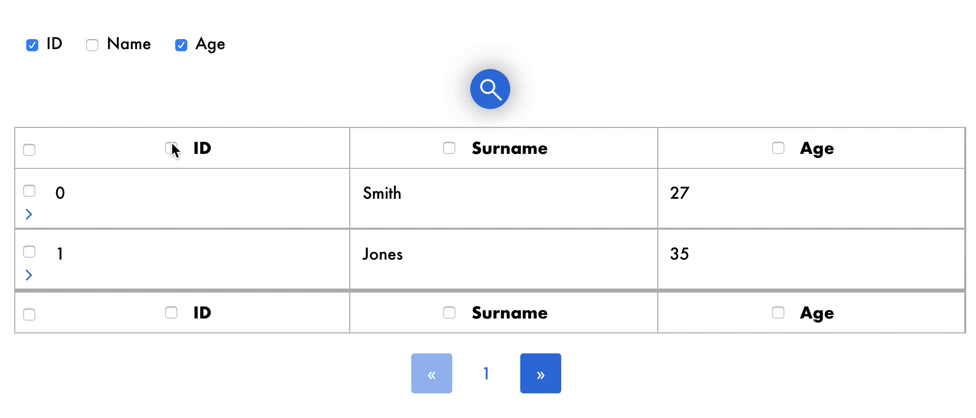
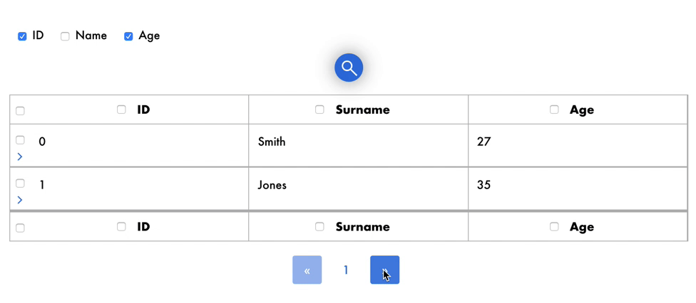
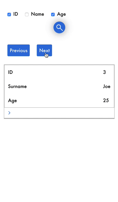
Pagination
For better browsing on data, a maximum number of rows is displayed and others can be shown just by changing page.
Show/Hide details
Each row may contain details that users can show and hide by clicking on the icon.
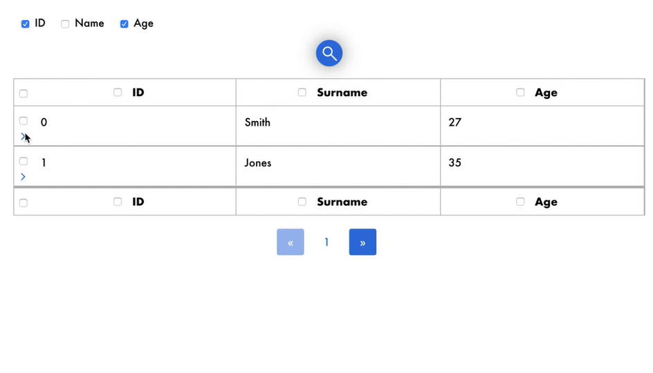
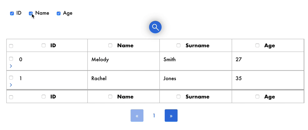
Show/Hide columns
Each column can be hidden or shown by clicking on the appropriate checkbox.
Responsive
Vuex-table is responsive, with simple and intuitive mobile User Experience.
Language Support (i18n)
Vuex-table is conceived to be translated in all languages. In order to properly set your default language you need the following elements:
- ISO 639-1 code in lowercase of the language (i.e.
enfor English,frfor French, etc) - A script or JSON containing all translations for each language you'd like to add
Example (for setting German):
// externalLangs.js

export default {
    "de":
        {
            "search": "Geben Sie Ihren Suchbegriff ein",
            "previous": "Vorheriges Item",
            "next": "Nächstes Item"
        }
    }
Then you can change your default language like this
import ExternalVuexTableLangs from '../langs/externalLangs.js;

<vuex-table current-lang="de" :langs='ExternalVuexTableLangs' />
Documentation 📔
Documentation is in the docs directory.
You can find here online documentation.
Quick start 🚀
Pss...it's easy! 😎
Install
npm install --save vuex-tableor
yarn add vuex-tableTo install dependencies
npm installImport
import Vue from 'vue';
import VuexTable from 'vuex-table';

Vue.use(VuexTable);
Example
<template>
    <vuex-table
        :headers="state.headers"
        :data="state.data"
        :selectable-columns="true"
        :selected-columns.sync="state.selectedColumns"
        :selected-rows.sync="state.selectedRows"
        :enable-details="true"
        :items-per-page="state.itemsPerPage"
        :current-page.sync ="state.currentPage"
    >
        <template slot-scope="props">
             {{props.data}}
        </template>
        <template slot="details" slot-scope="props">
            <span>Lorem ipsum dolor sit amet, consectetur adipisicing elit. Aut consequatur cupiditate deserunt eligendi eveniet iste iure, labore minus natus nostrum numquam pariatur placeat porro quia repellat veniam vero voluptatem voluptates.</span>
        </template>
    </vuex-table>
</template>
API
Properties
Name | Description | Type | Values | Default
--- | --- | --- | --- | ---backend-pagination | Use asynchronous data fetching from any API or backend | boolean | - | false
backend-sorting | Use asynchronous data sorting from any API or backend | boolean | - | false
current-lang | Current lang of the table | string | ISO 639-1 | en
current-page | Current page showed when initializing the table | number | - | 1
data | Data passed to the table | Object[] | required | -default-sort-direction | Sort direction by default | string | asc OR desc | asc
details | All opened detail slots by default | number[] | - | []
enable-details | Enable detail slots for each row | boolean | - | false
headers | Headers of the table | Object[] | required | -
is-sortable | Allow columns to be sorted | boolean | - | true
langs | Extra langs added by the user (see related section) | Object | - | {}
paginated | Enable pagination | boolean | - | true
selectable-columns | Allow columns to be selected | boolean | - | false
selectable-rows | Allow rows to be selected | boolean | - | false
selected-columns | Selected columns when initializing the table | number[] | - | []
selected-rows | Selected rows when initializing the table | number[] | - | []
total | Total number of items (for pagination) | number | required | -
Slots
Slot name | Description | Props (if scoped)
--- | --- | ---
default | Default slot rendered for each cell | field: string, row: number, column: number, header: Object, data: anydetails | Row detail (collapsible) | row: number
Events
Event name | Description | Parameters
--- | --- | ---
sort | Triggered when a sort is requested | header: Object, currentSortDirection: asc OR descnext-card | Triggered in mobile mode when the next item is requested | oldCard: number, newCard: number
previous-card | Triggered in mobile mode when the previous item is requested | oldCard: number, newCard: number
details-open | Triggered when a detail slot is opened | index: number
details-close | Triggered when a detail slot is closed | index: number
selected-row | Triggered when a row is selected or de-selected | selection: number[], newlySelectedRow: number (-1 if all is selected), isDeselected: boolean
selected-column | Triggered when a column is selected or de-selected | selection: number[], newlySelectedRow: number (-1 if all is selected), isDeselected: boolean
page-change | Triggered the current page change | oldPage: number, newPage: number
Collaborators 👩🏻💻👨🏼💻
License
Code released under MIT license.
Copyright (c) 2019, Superpitch.