
wc-bubble
v0.1.7
Published
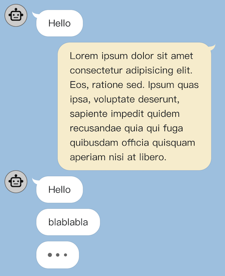
A lightweight and well designed chat bubble WebComponent.
Maintainers
 yishiashia
Readme
wc-bubble


A custom web component for a speech bubble.
Installation
You can install wc-bubble with npm, or just get started quickly with CDN.
Install from npm
To install from npm, open terminal in your project folder and run:
npm install wc-bubbleAfter the package is installed, then you can import the bubble web component into you code:
import 'wc-bubble';

window.onload = function() {
  let bubbleElement = document.createElement('chat-bubble');
  bubbleElement.textContent = 'Hello World';
  document.body.appendChild(bubbleElement);
}
Install from CDN
There is jsDelivr CDN available for quickly integrated with your web page.
<!-- Latest version -->
<script src="https://cdn.jsdelivr.net/npm/wc-bubble"></script>

<!-- Specific version -->
<script src="https://cdn.jsdelivr.net/npm/[email protected]"></script>
Basic Usages:
<html>
  <head>

    <!-- Load Bubble WebComponent library -->
    <script src="https://cdn.jsdelivr.net/npm/wc-bubble"></script>
    <!-- End Load -->

  </head>

  <body>

    <!-- Using "chat-bubble" html tag to generate Bubble -->
    <chat-bubble>
      <p>Hello World</p>
    </chat-bubble>

  </body>
</html>
Demo page
Attributes
right
If this attribute is set, the chat bubble will be aligned to the right.
avatar
String type. The URL or base64 encoded image of the user's profile picture.
continued
If this attribute is set, the chat bubble will hide the avatar and tail, making it appear as a "continued" chat message bubble.
loading
If this attribute is set, the chat bubble will display a CSS loading animation instead of the chat message content.
delay
Number type. The chat bubble display animation will be delayed by the delay value multiplied by the CSS variable --chat-bubble-delay time interval.
Element Properties
| Property | Type | Description | | --------- | ------- | ----------- | | right | Boolean | Indicates whether the chat bubble is aligned to the right side of the chat window.. | | continued | Boolean | Indicates whether the chat bubble is a continuation of a previous message. | | loading | Boolean | When this property is set to a truthy value, the component displays a loading animation in place of the bubble content. |
You can update the bubble component by setting its properties.
For example:
const chatBubble = document.getElementsByTagName("chat-bubble")[0];

if (chatBubble !== undefined) {
  chatBubble.innerHTML = `<p>hello world</p>`
  chatBubble.right = false;
  chatBubble.continued = true;
}
Event
mounted event
When the bubble is rendered and the display animation is finished, a mounted event will be dispatched.
Customized styles
By specifying CSS variables, you can customize the chat bubble styles, including the background color, font color, and animation delays.
For example:
<style>
  chat-bubble {
    --chat-bubble-color: #F5F5F5;
    --chat-bubble-right-color: blue;
    --chat-bubble-font-color: #333;
    --chat-bubble-font-right-color: white;
    --chat-bubble-avatar-color: yellow;
    --chat-bubble-delay: 0.2s;
  }
</style>
In this example, the --chat-bubble-color variable is set to #F5F5F5, which is a light gray color that will be used as the background color for the chat bubble.The --chat-bubble-font-color variable is set to #333, which is a dark gray color that will be used as the font color (text color) for the chat bubble.
The --chat-bubble-right-color variable is set to blue, which will be used as the background color for chat bubbles that are aligned to the right. The --chat-bubble-font-right-color variable is set to white, which will be used as the font color for chat bubbles that are aligned to the right.
The --chat-bubble-avatar-color variable is set to yellow, which means that the chat bubble avatar will be displayed in yellow color. You can customize this variable by adjusting its value to match your design preferences.
Finally, the --chat-bubble-delay variable is set to 0.2s, which means that the chat bubble display animation will be delayed by 0.2 seconds. You can customize these variables by adjusting their values to match your design preferences.