
yeti-table
v0.2.4
Published
Table Component for React

Readme
Simple Table Component for React
Features
- Display Values like you want, even add behavior to it or just use an string accessor
- Sort with default or custom Algorithms
- Fully customizable with Props and Callbacks
- Easy and fast Table Markup
- Light in filesize, current build is only 6kb small
- 100% Open Source and Free to use
- Optional factory styling
Example
import * as React from 'react';
import * as ReactDOM from 'react-dom';
import { Table, Column, CellProps } from 'yeti-table';

let data = [
    { name: 'John Cenedy', birthday: new Date(1998, 5, 30), street: 'Musterstrasse', streetNr: 15 },
    { name: 'Simon Maier', birthday: new Date(2000, 1, 14), street: 'Joachimstrasse', streetNr: '2b' },
    { name: 'Lea Wagner', birthday: new Date(1980, 7, 24), street: 'Bäckeralle', streetNr: 63 },
];

const AddressCell : React.StatelessComponent<CellProps> = (props) => <span>
    { props.value.street + ' ' + props.value.streetNr }
</span>;

const App : React.StatelessComponent<any> = (props) => <div>
    <Table data={ data } sortable={ true }>
        <Column
            header='Name'
            accessor='name' />
        <Column
            header='Age'
            accessor='birthday'
            getValue={ (birthday) => Math.abs(new Date(Date.now() - birthday.getTime()).getUTCFullYear() - 1970).toString() } />
        <Column
            header='Address'
            cell={ AddressCell } />
    </Table>
</div>;

ReactDOM.render(<App/>, document.getElementById("app"));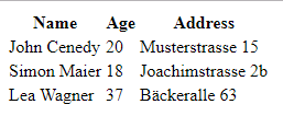
Configuration
Table
Prop | Type | Desc | Default
--- | --- | --- | ---
data | Array<any> | Data of table | null
styling | Styling | Styling classes for table. Read more about in documentation | null
sortable | Boolean | Is Table sortable. When True Table can be sorted after every Column | false
filterFn | (row) => Boolean | Only Rows which return true will be shown in Table | null
Columns
Each Column is represented by a Column Element inside the Table Body.
Prop | Type | Desc | Example | Default
--- | --- | --- | --- | ---
header | String | Name in the Table Header | Name | Required
accessor | String | String accessor for navigating in the Data Object. Can contain .. | employee.email | null
getValue | (obj : any) => string | Callback to get Value of Cell. If no accessor set, obj is full Row. | (row) => row.name | null
cell | React.StatelessComponent<CellProps> | Cell Component. props.value contains accessor value or getValue result or full row. | | null
sort | (a, b) => Number | Custom callback for sorting. 1: a > b -1: a < b 0: a = b | | null
sortable | Boolean | Overrides sortable of Table | | null
Factory Styling
To use the provided styling, you need to import the yeti-table/styling module. It will automaticly add all styling to your html markup. You then need can use the factory styling like any other styling object.
...
import { Table, Column } from 'yeti-table';
import { YetiDefaultStyling } from 'yeti-table/styling';
...
<Table data={ ... } styling={ YetiDefaultStyling }>
    <Column header='Example' />
</Table>
...
Installation
Via Npm
$ npm i -s yeti-tableThen
// ES6
import { Table, Column } from 'yeti-table';
// ES5
var YetiTable = require('yeti-table');
Documentation
Styling
To add your own styling to table you can use the styling prop from the table component. The styling prop requires a value of type styling. The type looks like the following:
export type Styling = {
    tableRoot? : string
    tableBody? : string
    tableBodyRow? : string
    tableBodyColumn? : string
    tableBodyCell? : string
    tableHeader? : string
    tableHeaderRow? : string
    tableHeaderColumn? : string
    tableHeaderCell? : string
}
Here is an example how you use this prop.
...
<Table styling={{
    tableRoot: 'mytable',
    tableHeader: 'header'
}}>
...
.mytable {
background-color: red;
}
.header {
background-color: blue;
}Custom Column Types
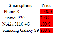
You can create custom Column Types with custom Behavior. For Example let's assume you need a Column which allways adds a red Background to the Column. The usage of this Column whould look similar to this.
import * as React from 'react';
import * as ReactDOM from 'react-dom';
import { Table, Column } from 'yeti-table';
import { RedColumn } from './redColumn';

let data = [
    { model: 'IPhone X', price: 1000 },
    { model: 'Huawei P20', price: 300 },
    { model: 'Nokia 8110 4G', price: 100 },
    { model: 'Samsung Galaxy S9', price: 800 },
];

const App : React.StatelessComponent<any> = (props) => <div>
    <Table data={ data } sortable={ true }>
        <Column
            header='Smartphone'
            accessor='model' />
        <RedColumn
            header='Price'
            accessor='price'
            getValue={ (price) => <a>{ price } $</a> } />
    </Table>
</div>;

ReactDOM.render(<App/>, document.getElementById("app"));
As you can see in the example. We are not using the Column for our Red Column, we use the RedColumn Component. This instructs yeti-table to use a custom Component for rendering this Column. Now let's take a look at redColumn.ts:
import * as React from 'react';
import { Column, TableBodyColumnProps, TableBodyCell } from 'yeti-table';

const RedColumnComponent : React.StatelessComponent<TableBodyColumnProps> = (props) => <td style={ { backgroundColor: 'red' } }>
    <TableBodyCell context={ props.context } column={ props.column } row={ props.row } /> // Needed for drawing the cell.
</td>;

export class RedColumn extends Column {
    public static bodyColumn = RedColumnComponent; // Important part, can be any type of stateless component.
}
The result will look like this:
Planned Features
- [X] Styling each component via prop.
- [X] Default styling.
- [X] Sortable with equal algorithm.
- [X] Sortable with custom algorithm.
- [ ] Customizable indicator for sort.
- [ ] Data from remote URL. Request Data automaticly from Backend.
- [X] Filter data with function.
- [ ] Filter data with props.
- [ ] Filter data with custom form.
- [ ] Filter in comination with remote URL. Remote filtering with Query Parameter.
- [ ] Plugin System
- [X] Use other types of Columns.
Plugin System
- [ ] Plugins can replace or add to individual components.
- [ ] Plugins can hook on events with callbacks.
- [ ] User can use individual components from Plugins to replace specific components. (Similar to current cell system)