
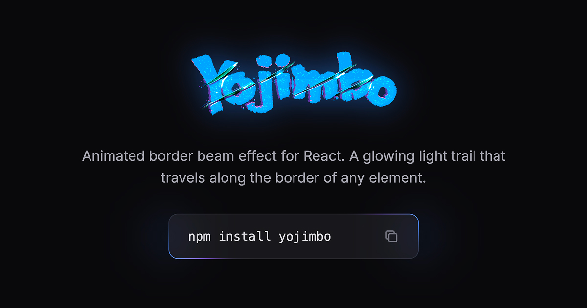
yojimbo
v2.0.3
Published
Animated border beam effect for React components. A glowing light trail that travels along the border of any element.
Maintainers
 selfishprimate
Readme
Named after Akira Kurosawa's epic 1961 samurai film Yojimbo, starring the legendary Toshiro Mifune. The effect is inspired by the gleam of a samurai sword — a sharp, luminous edge that catches the light as it moves.
Installation
npm install yojimboUsage
Drop the <Yojimbo /> component inside any element with position: relative and a border-radius. No CSS import needed — keyframes are injected automatically.
import { Yojimbo } from "yojimbo";

function Card() {
  return (
    <div className="relative rounded-2xl border border-gray-800 bg-gray-900 p-6">
      <Yojimbo />
      <h2>Your content here</h2>
    </div>
  );
}
Custom colors
<Yojimbo colorFrom="#3B82F6" colorTo="#8B5CF6" />Single beam, slower
<Yojimbo beams={1} speed={30} />Counter-clockwise with larger glow
<Yojimbo direction="counterclockwise" glowBlur={40} glowOpacity={0.9} />Custom blob sizes
<Yojimbo colorFrom="#FF6B6B" colorTo="#4ECDC4" colorFromSize={120} colorToSize={60} />No outer glow
<Yojimbo glow={false} />Props
| Prop | Type | Default | Description |
|------|------|---------|-------------|
| colorFrom | string | "#3B82F6" | Leading edge color of the beam. Accepts any CSS color value (hex, rgb, rgba, hsl). |
| colorTo | string | "#8B5CF6" | Trailing edge color of the beam. Accepts any CSS color value. |
| size | number | 250 | Overall beam size in pixels. |
| colorFromSize | number | size / 3 | Size of the leading color blob in pixels. |
| colorToSize | number | size / 3 | Size of the trailing color blob in pixels. |
| speed | number | 20 | Duration of a full loop in seconds. Higher = slower. |
| thickness | number | 1 | Visible border thickness in pixels. |
| blur | number | 12 | Blur amount for the beam in pixels. |
| glowBlur | number | 30 | Blur amount for the outer glow in pixels. |
| glowOpacity | number | 0.7 | Opacity of the outer glow (0 to 1). |
| glow | boolean | true | Whether to show the outer glow effect. |
| beams | 1 \| 2 | 2 | Number of beams. Two beams are positioned on opposite sides. |
| direction | "clockwise" \| "counterclockwise" | "clockwise" | Direction of beam movement. |
| className | string | — | Additional CSS class name. |
How it works
- A frame div is positioned over the parent element with
overflow: hidden - CSS
mask: content-box excludecuts out the interior, leaving only a thin border strip visible - Circular gradient blobs travel along the border using
offset-path: border-box - Two blobs per beam (leading
colorFrom+ trailingcolorTo) create the gradient trail - Optional outer glow orbs follow the same path with a larger blur for ambient light
Requirements
- React 18+
- Works with Next.js (App Router & Pages Router), Vite, CRA, and any React setup
- The parent element must have
position: relativeand aborder-radius
Browser support
Uses CSS offset-path: border-box which is supported in all modern browsers (Chrome 116+, Firefox 125+, Safari 18+).
License
MIT